As of the last report b Google “The New Multi-Screen World”, it’s email (not Twitter nor Facebook) that keeps being the most used (“read”) media among users – especially when watching TV simultaneously.
▅▅ stuff is a weekly newsletter about innovation trends in business, design and technology with a reader community in over 30 countries worldwide. As of its creator, Martin Redigolo, it’s directed to all those curious “people who think big to get big”.
The following 5 steps can inspire us of how to use a medium in a different way, although we might think there’s no room left to innovate.
1 Images tell more than words.
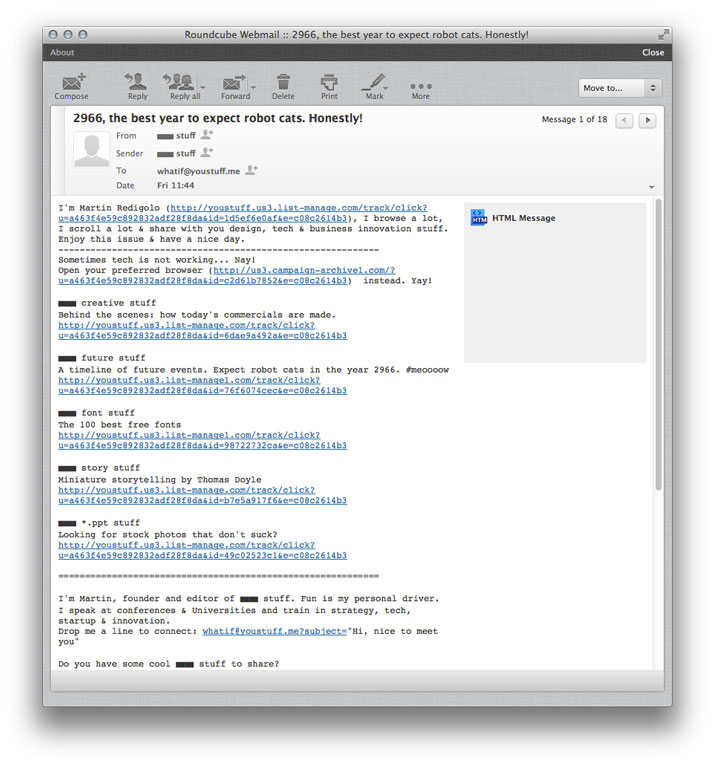
High quality photos or graphics used with the maximum size possible within the design we do not only capture the reader’s attention but will also optimize usability. As of the saying: “A pictures tells more than thousand words”. The full size image is being converted and used as the only link that leads the reader to the external content and whatever the size of your index finger should be, it’ll be impossible to not click the link.
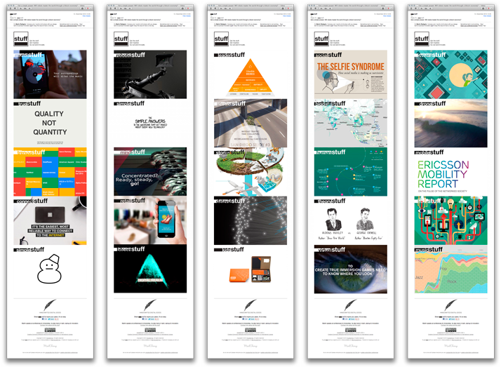
Each newsletter contains 5 images. “No need to read”
2 Text.
Unfortunately many conventional newsletters are filled up with text and there’s no way to digest some of them. Short phrases or titles that underline the images’ content are enough to give a quick idea about the links content. And as the font size is also bigger than usual, both User Experience (UX) and User Interface (UI) are again optimized to capture in the quickest and most comfortable way the contents.
3 Who said that plain text couldn’t be designed, too?
Today’s newsletters are usually design in HTML, but it’s still a good habit to send them also in plain text, just in case the user’s email client has HTML format inactive.
The plain text version of the newsletter can also be simple and visually well structured to allow comfortable reading and quick navigation. Keep your structure as simple and close to your branding as possible.
4 Think of the state of the user.
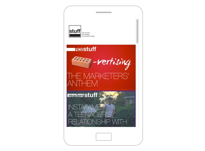
When/Where does he receive and read your newsletter and on which device? For that reaseon, make that your newsletter template is responsive (latest stats show the growing use of smartphones for these type of contents). The design will automatically be adapted to the screen’s size avoiding unnecessary scrolling or zooming that lead to a worse usability and experience.
5 Inbox-Design
Well, we’ve got our newsletter now but there’s still one more thing that needs to be designed. How do we want to appear in the user’s Inbox? Our name as sender as well as the subject are key elements to be different and to stand out from all other emails.
Want to see it in action? Have a look at past issues or simply subscribe to get innovative stuff once a week in your inbox.
▅▅ stuff – Get the stuff, get inspired, go out an innovate

